If you work in SEO and use Google Analytics 4, you have almost certainly opened both the Pages and Screens report and the Landing Page report. They sit right next to each other in the Engagement section, they both list URLs, and they both show numbers like views, sessions, and users. It is easy to assume they are two versions of the same thing.
They are not. They answer two different questions, and mixing them up is one of the quietest ways an SEO ends up drawing the wrong conclusion from good data.
This post breaks down what each report actually measures, what every metric on the screen means in plain language, and how to use the two together to build a real SEO strategy instead of just reporting numbers.
The core difference in one sentence
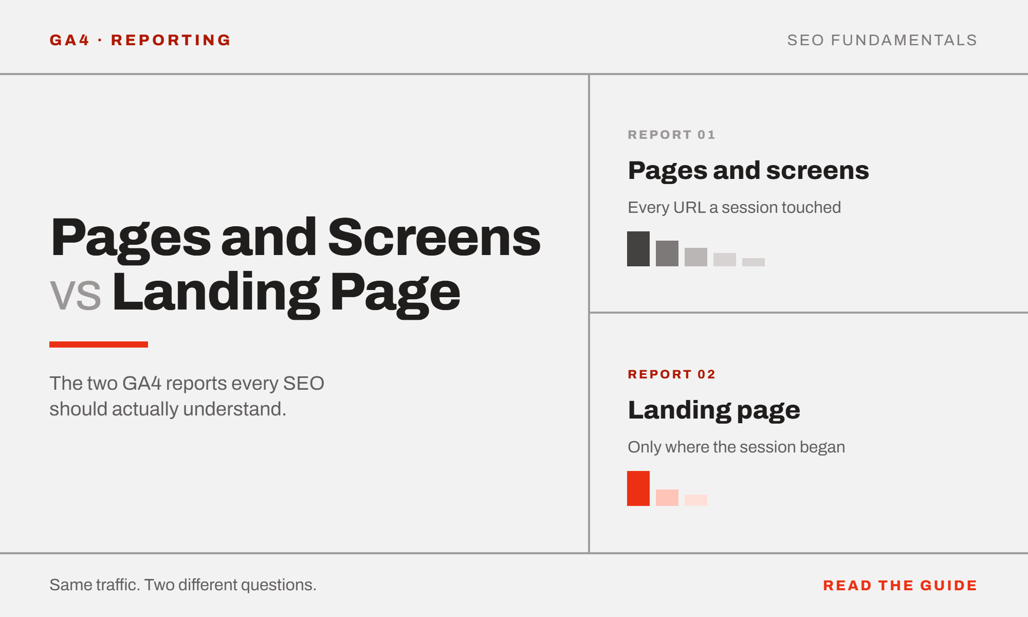
The Pages and Screens report counts every page view, no matter when it happened in the visit. The Landing Page report only counts the first page of each session, the page where that visit began.
That single distinction changes everything about how you should read each report.
Picture a visitor who searches for your business on Google, clicks through to your homepage, then browses to a service page, and finally fills out a contact form on a third page. In the Pages and Screens report, all three pages get credit for a view. In the Landing Page report, only the homepage gets credit, because that is the page that actually opened the session.
What each metric means, in plain language
Landing Page report
Sessions
How many visits started on this specific page. This is your real measure of “how many people did this page bring in from outside the site.” If a page has low sessions here, it is not attracting entries, regardless of how popular it is once people are already on the site.
Active users
The number of unique people who had a session start on this page. Compare this to sessions: if the two numbers are close, most visitors are only landing on this page once during the period. If sessions are much higher than active users, some people are entering through this page repeatedly.
New users
Of those active users, how many were visiting the site for the first time ever. A page with a high share of new users is doing genuine acquisition work, pulling in people who did not know about the business before. A page with a low share of new users is likely being revisited by people who already know the site, which changes what you’d expect it to do for you.
Average engagement time per session
How long, on average, someone stuck around after their session began here. This is a quality signal for the entry point itself. A page that pulls people in but sees a very short engagement time is either mismatched to what the visitor was searching for, or has a problem convincing them to stay.
Key events
The number of conversions (form fills, calls, purchases, whatever your business defines as a meaningful action) that happened during sessions that started on this page. Important detail: the conversion is credited to the entry page, even if it actually happened three pages later in the same visit.
Session key event rate
Key events divided by sessions. This is your real conversion rate by entry point, and it is usually the single most useful number in this report for prioritizing SEO work. A page that brings in a lot of traffic but converts poorly is a very different problem to solve than a page that brings in less traffic but converts extremely well.
Pages and Screens report
Views
Every time this page was loaded, by anyone, at any point in their visit, not just as the entry point. This includes people who clicked into the page after landing somewhere else.
Active users
Unique people who viewed this page at any point during their visit, regardless of whether they landed there.
Views per active user
How many times the average visitor loaded this specific page. A low number close to 1 usually means people view it once and move on. A higher number can mean people are referring back to it, or that it is part of a multi-step process they revisit.
Average engagement time per active user
Total time spent specifically on this page, averaged across everyone who viewed it. This is scoped tightly to the page itself, not the whole session, which is why it is usually a smaller number than the engagement time figure in the Landing Page report for the same URL.
Event count
Every tracked interaction (clicks, scrolls, engagement pings, and anything else your setup tracks) that happened while someone was on this page. A high event count usually just reflects high traffic volume, so read it alongside views rather than on its own.
Key events
This is the metric that matters most here, and it means something different from the Landing Page report’s version. This counts conversions that happened while the visitor was actually on this page, regardless of where their session started.
The insight that only appears when you read both reports together
Here is the part most people miss. Compare a page’s key events in the Landing Page report against its key events in the Pages and Screens report. The gap between those two numbers tells you what role the page is actually playing in your funnel.
Big gap, landing page number much higher than pages and screens number
This page is a gateway. People land here, then convert somewhere else later in the visit. Its job is to bring people in and hand them off, not to close the deal itself. If you are optimizing this page, focus on getting people to click deeper into the site (stronger internal links, clearer next steps) rather than obsessing over the on-page call to action, since the conversion usually isn’t happening on this page anyway.
Small gap, the two numbers are close
This page is self-sufficient. People land here and convert right there, without needing to browse elsewhere. This is a strong signal that the page’s own content, trust signals, and calls to action are doing real work. These are the pages worth studying as a template when building or improving other pages of the same type.
Neither pattern is automatically good or bad. A homepage acting as a gateway is completely normal. A homepage converting nobody at all while a specific service page converts at ten times the rate is the kind of thing that should change where you focus your content and internal linking effort.
How to turn this into an actual SEO strategy, step by step
1. Filter both reports to organic traffic only
Add a filter for your organic channels (Organic Search, and if relevant to your business, Organic Social and any AI-referral channel you are tracking). This removes paid and direct traffic from the picture so you are looking purely at what your SEO work is producing.
2. Start with the Landing Page report and sort by sessions
This tells you which pages are actually earning entries from search right now. Pages with real organic session volume are your proven performers. Pages with almost no organic sessions despite being indexed are either not ranking, ranking for the wrong terms, or simply invisible, worth a Search Console check to see which.
3. Look at session key event rate across those same pages
Some high-traffic pages convert poorly, and some low-traffic pages convert extremely well. This is where you decide what to do next: a high-traffic, low-conversion page usually needs on-page work (clearer offer, better calls to action, trust signals). A low-traffic, high-conversion page usually needs more visibility work (better targeting of the keywords it deserves to rank for, stronger internal links pointing to it, more content built around its topic).
4. Cross-reference with the Pages and Screens report for the same URLs
Check the key events gap described above. This tells you whether to treat each page as a gateway to strengthen internally, or a closer to replicate elsewhere on the site.
5. Watch for the mismatch pages
A page with strong Pages and Screens engagement time but almost no Landing Page sessions is popular once people find it internally, but is not earning entries from search. That is a targeting or visibility gap, not a content quality problem, and it is often an easy win since the content clearly already resonates.
6. Repeat monthly and track the movement, not just the snapshot
A single month of data tells you what is happening. Comparing month over month tells you whether your SEO work is actually changing behavior. Watch particularly for pages shifting from gateway to self-sufficient (a sign that on-page improvements are starting to work) or the reverse (a sign something changed on the page, or the traffic landing there has shifted intent).
The one habit that makes this genuinely useful
Do not just read these two reports side by side and note the numbers. Write down, in plain language, what each meaningful gap or pattern means for the business. “Sessions are up” is a number. “This service page is bringing in real organic traffic but converting at a third of the site average, meaning the visibility work is succeeding but something on the page is losing people” is an insight. The second one is what actually changes what you do next, and it is the difference between running reports and running an SEO strategy.